Home > Interactive presentations | The perfect solution for creating impactful presentations

Interactive presentations | The perfect solution for creating impactful presentations

What is an interactive presentation?

If you search on Google for what an interactive presentation is, it will show you links to articles with tips for delivering an optimal speech, with the reinforcement of visual aids. But in our case, we want to talk about something different.

In design, an interactive presentation is a downloadable file that allows the user to navigate, so to speak, within a presentation. There, they can find buttons, drop-down menus, animations, videos… It’s like being on a website. You can move through different screens with just a click, swipe, or zoom in on images, among other resources.

But why would a company or brand want to have such a presentation? Why is it so useful? Firstly, it saves on printing costs, as it can be used digitally only. And if there have been any changes in information, updating is even easier. However, there is a second very interesting reason.

Benefits of interaction

We live in a time when the vast majority, if not all of us, like to interact, to feel that we can choose what to consume. We all want to participate and be part of what is being shown to us, to stop where it interests us and find what we need just a click away, just a second away. And who doesn’t like to find what they’re looking for as quickly as possible? So we could say it’s a practical type of document, an increasingly used resource to capture clients.

What kind of benefits does it have? Let’s take an example comparing a printed catalog with an interactive digital one. When a potential customer takes a paper catalog, all they can do is turn the pages. On the other hand, with a digital one, a world of possibilities opens up.

Let me explain. Suppose a potential customer starts flipping through a catalog, sees an ad for a product, and becomes interested. What do they do? They search the brand on the internet, visit their website, take a general look, perhaps use the search bar… How many actions have they had to take? How much time will they dedicate to researching? Going further, if we were in the index of a PDF or a regular document, if the user wants to go to the section that talks about a topic they’re interested in, they’ll probably have to scroll, thus wasting that valuable time.

The objective of an interactive presentation is precisely to capture that customer before they lose interest. It will suffice to find the link to the website, perhaps located on the side of the presentation or in a button that says “learn more” or “subscribe.” This will undoubtedly increase sales and make the brand experience stand out.

Let’s talk about Videos.

It’s clear that paper can’t compete with animations. Think that within a video, there’s not only moving images, but also text and even music! But how can they be included? At the beginning of the presentation is a good place to help orient the user with a video talking about who you are, or a gif showing your services so they can see how they work in a few seconds.

With videos, you have the opportunity to showcase new products, announce news, highlight your projects… Take the opportunity to talk about the benefits of what you sell, for example, by conducting brief interviews with real customers that are motivating.

You can also embed content from other platforms in your favor, such as from YouTube, Maps, or your social media, all within your creation

Our design & UX recommendations

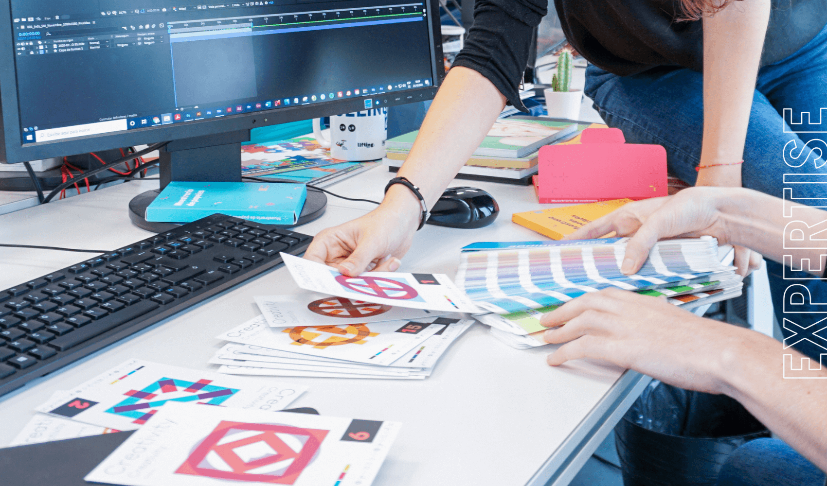
As the Imagine Creative Ideas team, we value the importance of good design to ensure success and allow the client to showcase what they truly desire. The most suitable program, which we use, is Adobe InDesign. Under the “Window” tab, in the “Interactive” section, you will find a set of tools that will help animate the document.

What aspects do we need to consider? As you have seen so far, the user experience is crucial. Because what good is a button if you can’t even detect it? I’m sure you’ve experienced this when downloading a mobile application or visiting a website. In an attempt to figure out how to use it, you tap everywhere without knowing where you are or where to go.

Instructions must be clear. We want to help, not confuse, for example, with unnecessary graphic elements or resources that are barely visible due to being too small or with colors that hinder readability.

Here are some essentials that are always present in our presentation designs:


  • Navigation menu

The navigation menu is very important, just like it is on a website. It serves as a basic guide to ensure that the user’s experience with the document is not a maze.

Here is an example:

presentaciones interactivas

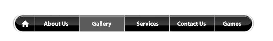
They can be located at the top or on the side of the document, and we recommend that it is always easily accessible to prevent the user from getting lost. In this example, the different sections of the presentation are clearly identified. It is necessary to indicate the current section to differentiate it from the rest. In this case, we are on the “Gallery” slide. The other hyperlinks appear in a different color to indicate that they are clickable
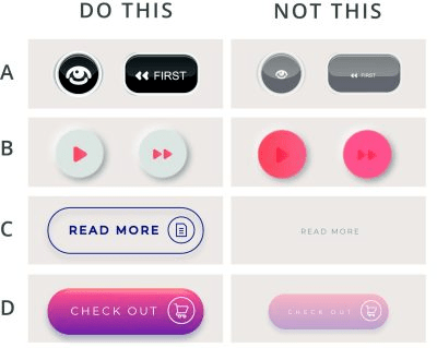
botones

  • The buttons

Let’s observe the example of the infographic we have created with things we do and do not recommend considering colors, sizes, and shapes

             botonescolores

  1. If text is included on a button, it should be large enough to be visible even for those who have difficulty seeing small things. However, without exaggeration. It is important to consider not only the size but also to avoid using a font that is too thin.
  2. Colors should be contrasted to correctly visualize the icon or text inside, taking into consideration that not all screens project the same and it may not be visible.
  3. Using shapes is the best way to indicate a button and indicate interactivity. In example C, we can see that not using shapes leads to confusion
  4. Reducing the opacity of a button makes it appear inactive, so caution must be exercised.
  • Infographics

infografia

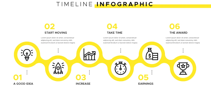
Timelines, dropdowns, moving elements, hidden tabs… Presenting a lot of information can be complicated and overwhelming. That’s why with an infographic, we allow the user to discover that data in a more dynamic way and make it stick in their mind.

Lastly, let’s not forget to apply animated designs. For example, making buttons change style when hovering over them improves the user experience. Using transitions from one page to another is the key to transitioning from static to motion. However, care must be taken not to make them too exaggerated. And of course, as we mentioned before, including videos or gifs is a great advantage, first as a decorative element to make it more engaging, and secondly to showcase products or a place in a practical way

Have you used this tool to promote your brand?

If not, will you now consider using it knowing how beneficial this digital format is? We have seen that customers will stay with you longer if you can quickly, easily, and intuitively capture their attention using the right resources: videos, buttons, infographics, and more. It is essential to provide them with a great experience in just a few minutes. And that’s where we come in: Imagine Creative Ideas, together with our consulting and marketing agency, Lifting Group. With over 15 years of experience in project development and digital strategies, we will ensure that your presentation meets all the necessary requirements, both in terms of design and UX, so that nothing hinders your business’s growth.

CONTACT US


JOIN THE NEWSLETTER!

Subscribe to our Newsletter and don't miss our insights